
PROBLEM
Commodity Fragrances needed to revamp their Welcome Email Flow to better align with their branding and improve engagement.
The original welcome flow was underperforming: it was too complex in structure to guide users effectively and too minimal in visual design to reflect Commodity's elevated brand identity. This mismatch led to low click-through rates and limited brand impact for new subscribers.
Commodity Fragrances
email welcome flow designSOLUTION
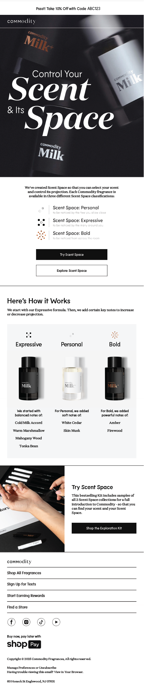
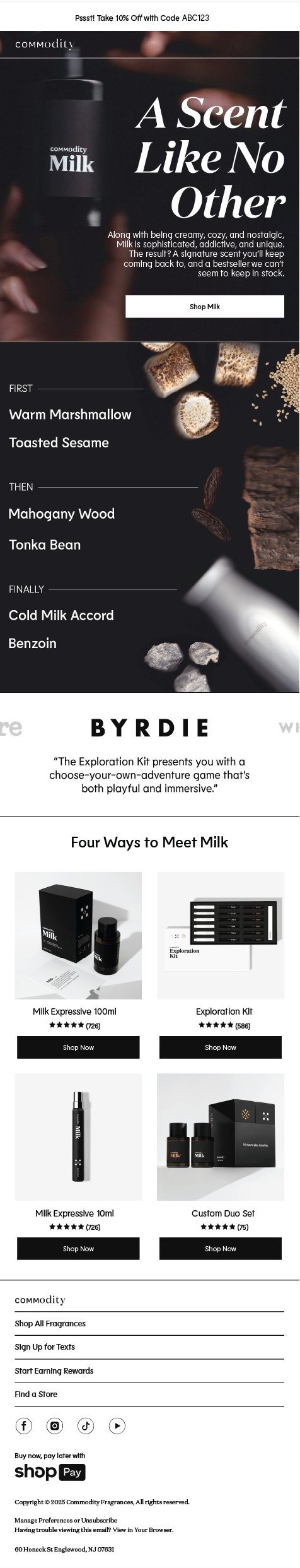
I led a full redesign of the Welcome Flow to better engage new subscribers while staying true to Commodity’s brand identity. The redesign focused on clarity, storytelling, and visual alignment.
I collaborated with the Email Marketing Manager, VP of Marketing, & Copy team to map out a 5 touchpoint flow, with more focused, purposeful messaging than previous iterations.
As lead designer, I created a cohesive visual system using Commodity’s updated branding. I focused on enhancing content hierarchy for scannability and stronger CTAs.