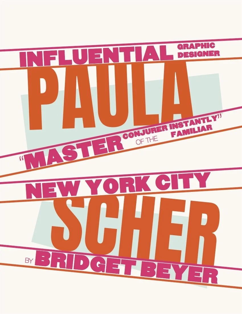

Designer report: pAULA SCHER
PROBLEM
For this project, I was tasked with designing a printed report that paid homage to a renowned graphic designer through a biographical brochure. I chose Paula Scher—an iconic figure whose bold, experimental work has long inspired me. The challenge was to create a piece that not only documented Scher’s life and career but also captured the distinctive visual language she is known for. The goal was to reflect her influence authentically without directly copying her style, while also incorporating my own design voice.
SOLUTION
Inspired by Paula Scher’s bold posters and experimental typography for The Public Theater, I set out to design a report that captured the same energy and spirit. I played with dynamic type, bold weights, and unexpected spacing to reflect her layered, expressive style. To add my own twist, I softened the palette—mixing pastel blue and off-white with pops of bright orange and pink—to strike a balance between playful and refined. The layout leans into asymmetry and nontraditional formatting, giving me space to explore creative compositions. I also included a gradient spread as a nod to her iconic poster series. The final piece is both a tribute to her work and a reflection of how her style continues to influence my own approach to design.
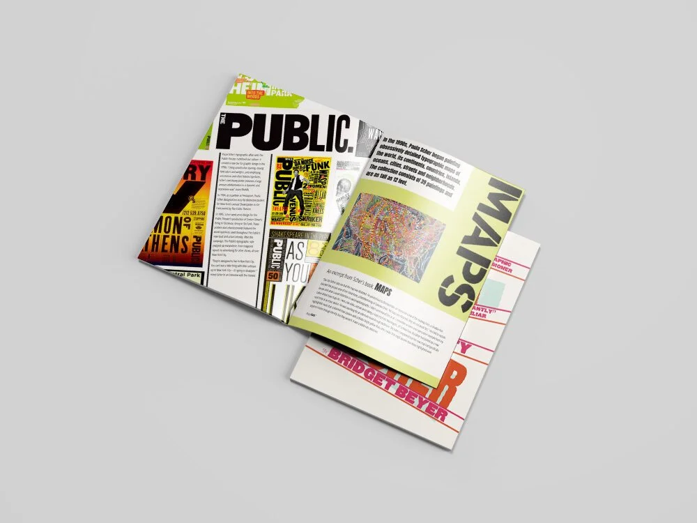


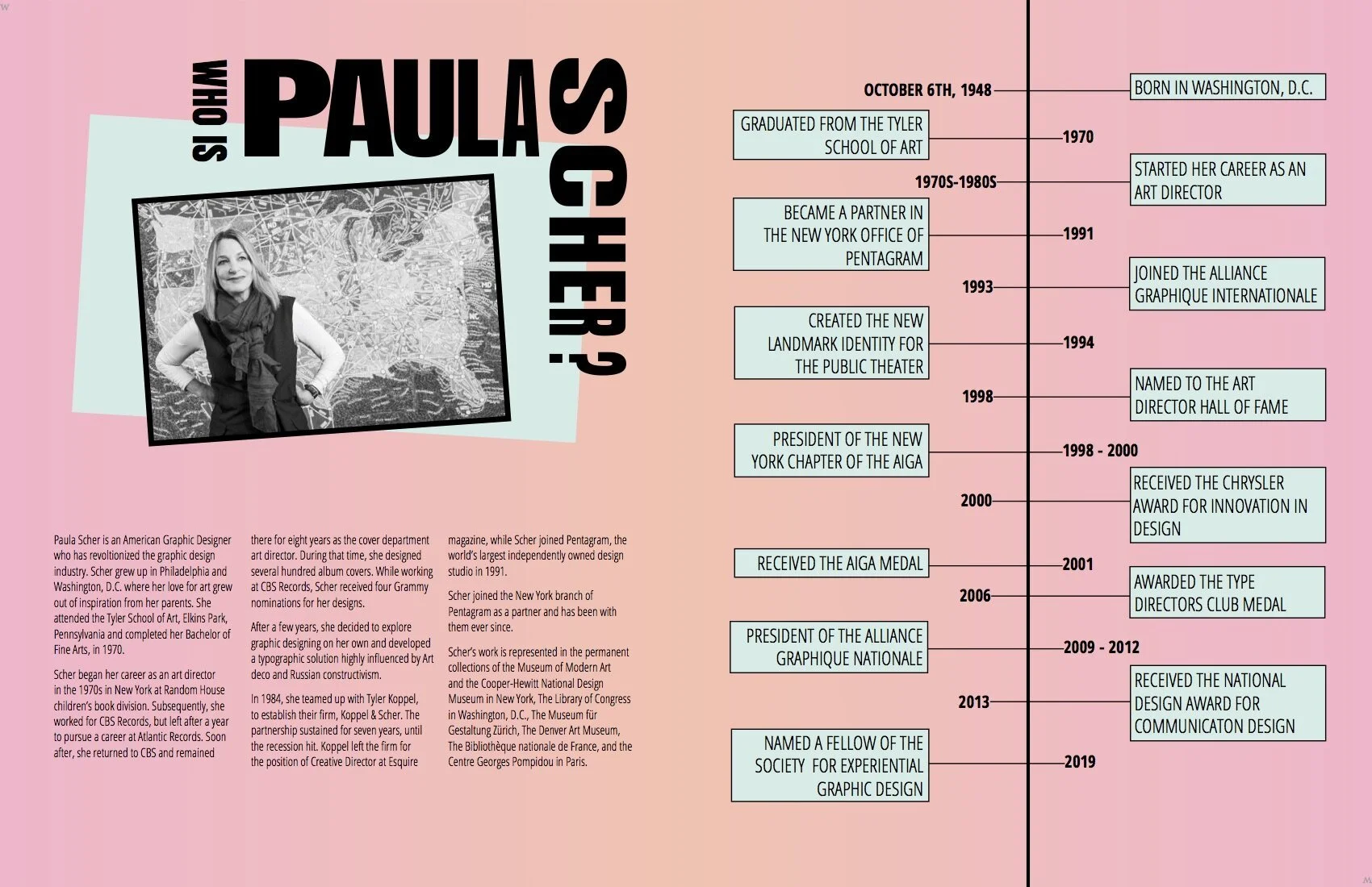
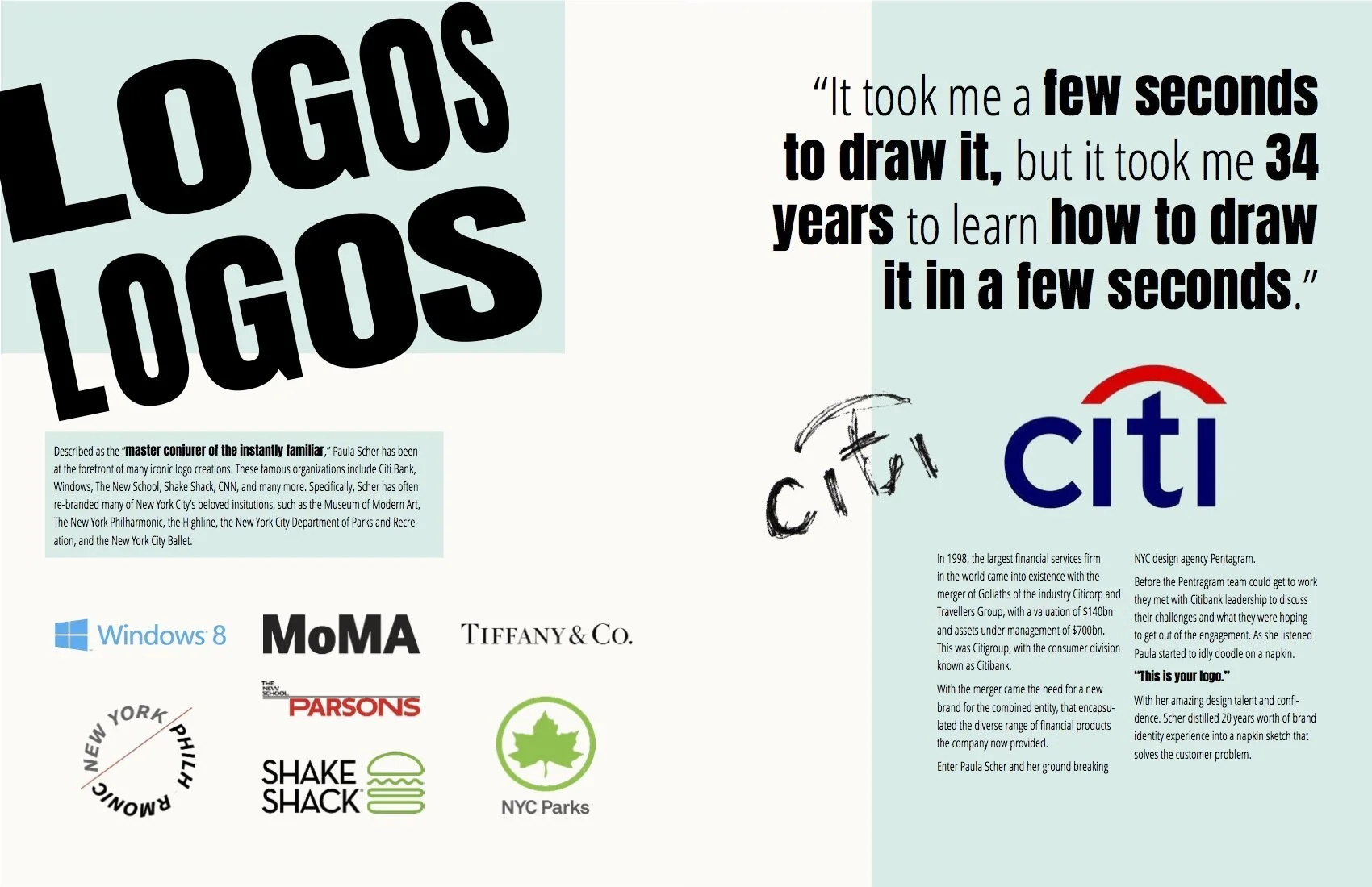
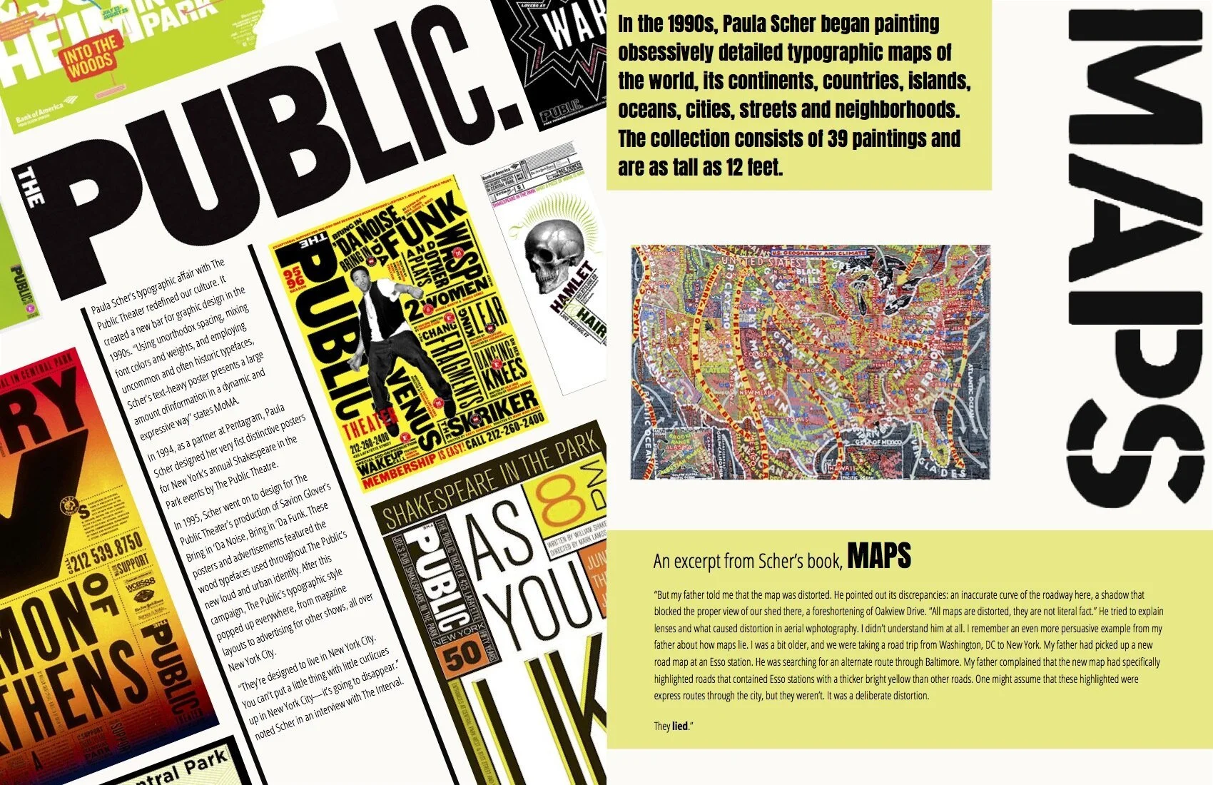
The Spreads